Blog

Responsive vs. Adaptive Design: Reframing the Conversation

Responsive design has been around for years. It is a design methodology that allows the content on a web page to shift layouts as the browser window is resized, even down to mobile devices. This practice uses the same code by adding in media queries to call a different CSS or allows the individual content elements to flow as the content container is changed. Responsive design is great for desktop browsing experiences that allow the user to choose how they view your content. This also allows the content creators to manage all the same content across a multitude of devices.

However, some elements work on desktop, but don’t work on mobile. Responsive practitioners have become adept at scaling images, transitioning content or hiding specific content that doesn’t fit.

Responsive design helps give versatility to your content, allowing it to be consumed through a multitude of channels.

IMG_0648

Where responsive design falls short, is it’s generally a one size fits all approach. The layout of the content is the same regardless of the context in which you’re consuming it. That means if the main content is image heavy or even text heavy it will load all the same content, regardless of the data connection or information need. If the user is on an iPhone they will see the same content as any another user on an iPhone.

Adaptive design is an approach that serves up similar content depending on what channel you are accessing the content on. Adaptive is not like responsive in that the layout on each device is often custom designed. This allows for greater control of the design, functionality and content.

It also means that multiple code bases need to be managed. A change to one, means you must change all in order for it to be consistent across all channels. If you have the resources and adequate processes to manage multiple code bases, I think the trade off is worth it.

Fortunately, it is not an “either/or” decision. We can use elements of both approaches to make elegant designs that work on a multitude of devices and serve a variety of information needs the customer may have.

image

Often when talking about adaptive design we stop short of what is actually possible with adaptive design. We talk about device type and that’s about it.

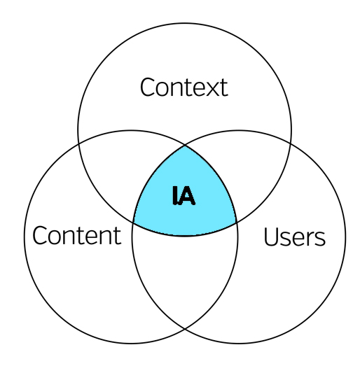
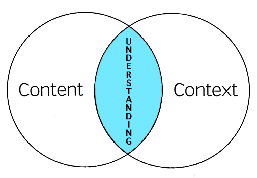
I believe adaptive design should not only look at the physical device it’s be displayed on, it should look at the context in which it’s being displayed.

We can leverage any number of APIs in the device to determine the context of the user. For example, we can use GPS in the users phone to determine at what rate of speed they are traveling. If they are traveling between 1-5 mph, they may be jogging. The information need is different at this speed then when standing still. The same can be said if they are traveling at 65 mph. The text in your content may no longer be relevant and it’s only the interactive elements that matter.

Adaptive design could also utilize the download speed to adjust the content. If the user in on wifi, all content can be loaded simultaneously, but if they are on slower bandwidth, then lazy loading might be a better solution. Users on slow networks can be served up lower quality, compressed images, while faster speeds will see full resolution, retina images.

The applications for adaptive design utilizing context is seemingly endless. They can be gathered through shared APIs on the device or through user toggles or settings.

Apple started doing this with their “do not disturb” setting. A user can now set the context for how and when an app should function.

image

When I think about applications that could utilize adaptive design, Apple Music and Podcast apps are top of mind. When I’m at my desk, the small buttons and large album art are annoying, but don’t pose any great usability issues. I’m still able to access all my music and podcasts with minimal effort. However, when driving home from work at 70 mph, the lay out of these apps pose new challenges. Skipping songs, replaying sections of a podcast or song or even changing the volume can be unusable or even down-right dangerous. If the app is able to intuit that I’m in my car and no longer stationary, it could serve up new content that fits my context and information need – big buttons and no album art.

When we not only consider the device, but also consider the context in which our content is being consumed, we will achieve the true definition of adaptive design.

Information Architecture and the Sofa

Imagine you just moved into a new apartment. You have an amazing sofa and a big screen TV. You’ve envisioned exactly how you’re going to set up your living room. It will be awesome. Your friends and family will come over and be in awe at the beautiful way you’ve designed your new space.

But what happens next is anything but. You lug your sofa up 3 flights of stairs only to find it’s 6 inches too long for the space you planned and covers the sliding glass door to your patio.

You set up your TV above the fireplace only to find the cable and electrical plugins are located 10 feet away. You must run a length of unsightly cords across the room.

And where is that bookshelf going to go? There isn’t any space created for it. I guess it’s going to have to go to your crazy cousin who doesn’t even own a vehicle and needs you to deliver it. We’ve all been there.

red-sofa

Your UX designer may have experienced the same thing in a digital space with your information architecture.

You laid out the infrastructure of the site beautifully, but what they’re left to design around really stretches their creativity to its outer limits.

Information Architecture is not web design, in the same way architecture is not interior design. But they are fundamentally tied together.

Architects (information or otherwise) need to consider the role the designer plays in the final product. We need to understand what new technology the UX designer might want to employ or new design trend they may follow.

We need to work hand in hand with our designer to understand the vision of the final product. There will be compromise. You may get that new navigation menu you wanted, but have to concede the placement of certain buttons. Your designer is important in the process. They are not just there to slap color on you architecture. Your collaboration is integral to the final user experience.

Great architecture with horrible design is just as bad as confusing architecture beautifully designed.

The same is with IA. We may not pick the “wallpaper” or “furniture”, but we need to build a system with that arrangement in mind.

Another thing to keep in mind is which spaces rely on the placement of other spaces. A sofa placed perpendicular to the TV will not create a great user experience when binge watching Doctor Who. Or a TV placed near a window may create a glare that makes daytime TV watching out of the question (sorry, no more Judge Judy).

Once you think you’ve considered every possibility of sofa/TV combination and architected accordingly, you may think you’re done. But have you considered A/B testing post-architecture? What if during user testing you find out the acoustics in the room actually make the sofa/TV arrangement better in a different location? Does your architecture allow for such deviation?

These are important question every IA should be asking themselves before finalizing the architecture. It’s not as easy to re-architect your site as it is to redesign it.

4 UX Myths

1. Content Should Be Above the Fold

In the mid-90s the internet was new to most people and scrolling was a new concept people had a hard time wrapping their minds around. But now it’s second nature for most people. You no longer need to squish everything into the top of your page anymore. This is especially true since we don’t even know what above the fold is any more, due to the various dimensions of devices and screen resolutions.

Print

Above the fold on my Retina display MacBook Pro is different than the Samsung monitor it is connected to. And above the fold is different on my iPhone versus my iPad. Above the fold is meaningless.

However, it’s still important to design your content in such a way that tells the user there is more below. If the header image cuts off perfectly along the bottom of the screen, the user may not think there is more content below. Also, it might mislead them to swipe to the right or left thinking it’s an image gallery.

While above the fold is still important and should be a consideration, it should never be a place to cram too much content. Content should be well spaced with signals to lead the user further along the page.

Here’s what others are saying about the fold and scrolling:

  • Chartbeat, a data analytics company, found that out of 2 billion visits to various websites, 66% of the users attention is spent below the fold. Scrolling Behavior Across The Web
  • ClickTale found that 76% of users scrolled within seconds of landing on the page, with 22% of those users scrolling all they way to the very bottom of the page regardless of the length of the page. Scroll Research Report
  • Huge, a design agency out of NY, performed usability tests and fond that participants always scrolled, regardless of visual cues. Everybody Scrolls
  • In July 2011, Apple removed the scroll bar from Mac OS X. This shows that we are so familiar with scrolling we no longer need a visual cue to do so.

2. White Space is Bad

White space refers to the empty space between various elements of a page layout or design. White space is often either neglected during design or thought of as bad – a valuable waste of screen real-estate. However, it plays a huge part in page readability and content prioritization.

Imagine you landed on a page that had no white space. What are your thoughts? Cluttered? Illegible? Information overload?

white-spaceWhite space allows the for better visual navigation through page and provides a feeling of sophistication and luxury. Cheaper brands want to cram more into the available space so that they can sell more. More confident brands (such as Apple) can afford more white space to better allow the product to speak for itself.

White space is not wasted space. It is an intrinsic and functional part of the design.

More about white space: White Space in Interactive Design

3. Always Follow the Leader

“Just because a design is published doesn’t mean it’s performing” – Stuart Maxwell, Information Architect at REI

This is a very common mistake, not necessarily by UX professionals, but by business leaders during discovery meetings for new design projects.

Have you ever heard this in a meeting?

“Check out [insert big name site]. See how they do [insert design element]? We should do ours like that.”

lemmingsIt’s fine to find inspiration and to, in some case, outright steal design ideas, but you should at least make sure they are working first. The very company you are finding your inspiration in might be going through the same redesign project you are because something’s not working. By using similar designs, layouts, etc. you may be setting yourself up for failure and be right back where you started, or worse actually harm you business.

Now even if you discover a particular design or layout is working for a particular site, doesn’t mean it will work for you too. Your users needs and values are not the same as everyone else. You have something special to offer them; a culture, lifestyle, service or product that is unique only to you. So don’t copy without knowing if it will work for you or at the very least user test your poached designs before publishing.

Other great reading on this topic: The “Just Copy Amazon” Fallacy

4. Testing is the Final Step

Waiting until the end to see if your theories are correct will only set you up for disappointment. Now whether you tested with your team, in-house or just know that certain design trends are “proven” does not fulfill the user testing requirement.

I’ve heard this many before, “Let’s just ship and we’ll iterate later.” This approach may help you get first to market, but will not increase engagement and may frustrate your users if you keep changing the design, layout or functionality. They may have to relearn behaviors to use your site; you can only do this so many times before they leave and never come back. Not to mention the fact that V2 is a lie.

user-testing

Beta-testing only works if the beta-product is near full-featured. If it’s buggy or unusable, you may have blown your one shot at capturing a new, life-long customer.

Instead test early and often, and not with in-house “users”. They’re often to close too the product to give truly critical feedback or understand basic functionality intuitively because they are familiar with other design projects.

For me reading: Testing Your Product Early and Often

Theory and Practice of Information Architecture

“Theory pursued in the absence of a dialogue with practice, turns inward on itself leading to the ever circular systems of abstractions that lead only to other abstractions. Practice without an inquiry into theory becomes a purely commercial activity where the only value that gets assessed is value to the marketplace.”

-Jesse James Garrett (IA Summit 2016)

Full video here

New Challenges for First-Time Managers

Congratulations! You’ve been promoted. Now what?

In your previous role you were a rockstar. They saw something in you and you’ve been asked to lead the next generation of leaders.

As a new manager you will make mistakes and face new challenges, no doubt about it. However, a little preparation can help you through these common, new challenges.

1. It’s Lonely At The Top

lonely-tallYou used to hang out with everyone after work, at the pub or at the weekend BBQ, but now the phone no longer rings. This can be shocking and depressing for new managers, especially if your team used to be your coworkers. It doesn’t mean they don’t like you. They just need time to blow off steam after work and they’d prefer not to do it with their boss. They might also be afraid of saying the wrong thing after a few pints and have it affect their career.

Instead find new peers to hang out with. You’ll want to find fellow managers or others in your line of work or industry leaders. These can be great new relationships, as they can mentor you to become an effective manager.


2. No More Gossip

Be honest, you enjoyed those times of bad-mouthing the company, coworkers or management. Well, no more. You are now the ambassador of the company and its mission. You cannot afford to partake in those gripe sessions any longer. You will lose your teams respect and create an atmosphere of complainers. You need to speak positivity into your teams life and work environment. They need to have a belief that the leaders of the company have things figured out and will fix any issues that cause these gripes. If you participate, you identify yourself as not being part of the solution.

This does not mean that if one of your team members begins to complain, you walk away. This means that you listen and don’t join in. They need to feel they are heard and that you have a solution, or at least understand their issue and frustration. If you do come up short on identifying a solution, ask them to provide one. They may have some great ideas.

3. Gaining Respect

In order to lead effectively, you need your team’s respect. Whether you are inheriting a new team or managing your previous peers, each has it’s own challenges. This is a much bigger topic, but there are a few quick ways to gain respect as a new leader.

First, never get too attached to your title. Just because you are a manager doesn’t mean you don’t need to roll up your sleeves and get in the trenches with your team.

Second, be open and honest. Your team can tell when you’re holding back or not being truthful. You’re not that good of an actor. If you don’t know the answer, don’t make it up. Tell them you’ll work with them to find the answer. If you made a bad decision, fess up. Own your mistakes and learn from them.

Finally, be decisive. You may come to a fork in the road where a decision needs to be made to go left or right. New leaders often freeze if they don’t know which way to go or don’t have all the information. Be decisive and pick a path – go with your gut. If it turns out to be wrong, own it and double back and take the right path.

4. Fear

management-fearThis is probably the most common challenge and even comes up from time to time for long-time managers. Previously, your KPIs were completely under your control. But now your KPIs are often centered around your report’s success. And their success hinges on your success as a manager. This can be scary and overwhelming. Now, not only do your failures hurt you, they hurt your team.

When you have a team that is motivated and self-starting, this can be an easy transition. But if they need that extra push or special direction, this can be downright terrifying. Just remember, you used to be in their position. You know what you needed from your manager. Start there.

As you get more comfortable you can learn their strengths and learning style to help you lead them better.

Finally, the biggest remedy for any of the challenges you will face is to constantly be learning. Find a mentor. Read books. Watch training videos. But most importantly, never assume you’ve got it all figured out.

Understanding Content and Context

If you’ve spent anytime researching or working with Information Architecture (IA), you have certainly come across this venn diagram.

content-context-venn

It shows that IA is at the convergence of content, context and the user. Rosenfeld and Morville referred to this as the “information ecology”.

Context is the business goals, funding, politics, culture, technology, resources and constraints

Content is documents, signage and data types or the structure of things

User is the audience, customer or agent

Although this diagram has been useful for many years to help show 3 important factors of good IA, it falls short in a few areas.

Because of this, we need to change how we look at this diagram.

First, I propose “understanding”, not Information Architecture, is at the convergence of user, content and context. Instead of being at the center, Information Architects are the unseen force arranging the meeting of these areas.

Although there are 3 areas influencing IA, all we really have control over is 1/3 of the venn diagram, the content. Context and user are predefined variables outside of our control. As we manipulate the content circle we increase, or decrease, the overlap of content and context and user, thus increasing, or decreasing, understanding. This means we need to thoroughly understand the relationship between user and context, prior to working on forming the content of our site and/or app.

Secondly, I believe the definition of context is partially, if not completely, wrong. Context is not the business goals or resources. Context is actually made up of 4 basic parts: the environment, culture, psychology and physiology of the user at the time of the interaction with “stuff and things”. Or as Andrew Hinton puts it in his book, Understanding Context, context is the “where” and “who” of the user.

The 4 basic parts of Context:

Environment: the surrounding climate, location and artifacts where an interaction is taking place (i.e. outside, inside, summer, fall, traffic, London). The interactions our users have with our systems is different when they are stuck in traffic in a big city versus when they are at home on the couch. A users information need is different in these 2 environments.

Culture: a users core belief systems established through nature and nurture (i.e. religious or political beliefs, sexual preference, gender identity, nationality). Language will have different semantics on site created for the African trophy hunters compared to GLAAD.org. Understanding your users core beliefs is key to not only serving them better, but to prevent alienating them with “harmless” syntax.

Psychology: a users mindset or emotions at the time of the interaction (i.e. happy, angry, distracted, frustrated). A users mindset when sitting down to binge watch their favorite TV shows on Netflix is different than when going to their banks website to find out why their paycheck wasn’t deposited and caused their mortgage payment to bounce. The users tolerance of poor navigation or confusing interactions is different because of their psychological state.

Physiology: the users actual body state (i.e. blind, deaf, left handed, tall, fat). The buttons and colors on an app designed for children may need to be designed differently than for professional sumo wrestlers. Button interactions may be more difficult for people with larger hands and will need be designed with this in mind. Blind users may need different queues instead of the normal audio queues after a button is pressed or an action took place.

Because of the above definitions, I believe that the user and context circles are even more “intertwingled” than the original venn diagram illustrates – even to the point of complete overlapping. Thus, we can simplify the venn diagram to merge user and context together into one circle.

content-context-venn2

In the end what you are left with is that understanding is at the intersection of context and content. Our job as information architects is to organize the meeting of content and context. The closer we move them together, the greater the understanding for the user.

content-context-venn3

This new arrangement is important to understanding the role of IA in creating understanding. If we don’t know the beginning point of context, then how do we know if we should move the content circle right, left, up or down. To fully understand context, you must understand how environment, culture, psychology and physiology inform the user behavior. Mind you, this is no easy task, but critical.

Because context plays such a critical role in understanding, Information Architects must wear several hats to bring about this understanding. We must be anthropologists, psychologists and content specialists. We must study human behavior within these contexts in order to inform our work.

Instead of using a clichéd venn diagram to describe our work, I propose a new word: Contexnt or maybe Contenxt. Okay. I’m still working on it. Instead, below is a visual representation of this ideal.

content-context-understanding

When content and context completely overlap we will bring about great understanding and great user experiences.

Patterns of Effective Teams

“Some teams are orders of magnitude more effective than others, turning around business solutions in days or even hours. Their secret is a combination of smart technology choices, great development habits and a powerful team dynamic. In this talk Dan describes a number of patterns of behaviour that he’s identified working with some great teams, beyond the basics of co-location, stand-ups and pair rotation. You’ll gain a new appreciation for old techniques like code reviews, and even working in silos won’t seem so bad!”

Dan North @ New Developers Conference in London

How to Develop an Employee Career Path

  • Developing an employee across a predefined path can take talented employees out of a role they are good at and fill it with a less talented employee. Instead, develop multiple paths and let the employee decide what path they want to take (role expert vs. trainer vs. manager).
  • Establish a model of specific tasks employees can specialized in, while maintaining a general knowledge of others to retaining a loose integration between team silos.
  • If an employee wants to transfer from one silo to another, develop a clear path to do so.
  • Expecting the employee to be a “Jack of all trades” prevents them from mastering specific roles and inhibits their growth.
  • An “earned autonomy” path can be more engaging and motivating for some employees than a management career path.
  • Each new step in the path should come with either a perk (ie. earned autonomy, ) or increased responsibility with compensation.
  • Identify early what path employees want to take and mentor them across this path.
  • Having a clear and defined career path will increase employee engagement.
  • Engaged employees call in sick 33% fewer times a year than disengaged employee.

The Power of Storytelling for the User Journey

Storytelling is a great tool to help you understand the user journey.

Every user is the hero in his or her own story. Every visit to your site or app starts as a story with a goal and inciting incident, crisis, climax and an end. How we craft the user journey through the site will depend on the user goal. If we don’t understand the user or their goal how can we craft a user journey that helps them get to their a resolution of their goal.

To determine the goal of each user, we must first create personas to attach predefined goals to. A persona may have several goals and each needs to be factored into the crisis and climax moment. Personas is not the same as demographics. Personas takes much more thought and interacting with the user than just looking at analytics. Well defined personas are designed around goals, psychological profiles and user context.

In order to improve engagement and loyalty, we need to carefully create a crisis moment in the user journey. When a user overcomes the crisis, their loyalty to the story increases. They feel a sense of accomplishment. This crisis should be created in such a way that every user can overcome it, without creating a cliffhanger. This does not mean we create temporary painful user experiences only to manufacture a false sense of accomplishment. The crisis moment could be that they can’t find the right product and your site helps them navigate to find everything they needed and more. The crisis moment could be financial in origin. Just when the user thinks they can’t pay for the products they want, you present them with a coupon or bonus item or some content to move them beyond the crisis moment to a climax moment.storyarc-green-eggs

The climax is the resolution of the initial goal. They found the product or service they were looking for. Your site or app helped them accomplish this goal.

However, if a user arrives at the crisis moment and you do not help them to move to the climax moment, their story may result in a cliffhanger (ie. exit site or app). The crisis/climax transition needs to be crafted in such a way that the user knows you will help them through it and quickly. They must see the light at the end of the tunnel.

Once you feel you have the major elements of your story outlined, you can begin mapping that user story through storyboarding. As you map this out you may come across “subplots” and need to map those out as part of the journey as well. All goals, plots and sub-plots must find resolution to bring about a satisfactory conclusion for the user and build that loyalty to your product or service.

The user story could be episodic (a single visit) or a fully mapped user journey (life goals) with multiple crisis/climax moments. Each is important and should be mapped for each persona.

Defining the user journey through storytelling will not only help you to better understand your user and help them reach their goals, it will help you present these ideas to key stakeholders in your organization, either through storyboarding or user journey maps. As design and development get underway to support the user journey, each stakeholder can reference the story to determine if what they are designing and building matches the story arc and helps the user accomplish their goal.

Top 5 Tips for Self-Mastery

In Robert Greene’s book Mastery he describes 3 steps in your journey to becoming a master of your craft: learning, practicing and mastering. Each step must be done intensively and deliberately. Along your journey, no matter the step, you will need to exercise these 5 tips to fully achieve mastery of both self and your craft.

1. Adjust Your Focus

You need to adjust your mind-set to one of taking full and complete responsibility for whatever is happening in your life. Once you accept your current state at this very moment you can begin the necessary work of moving yourself forward. If you have a mind-set that circumstances are out of your control or that it is someone else’s fault, you will be destined to repeat your past mistakes. Your battle for mastery will be won or lost in your mind before you even begin.

focus

2. Gather Feedback

In order to truly assess your strengths and weaknesses you must elicit feedback from your peers. This can be uncomfortable, or painful, but you must begin the journey by assessing what tools you need to bring with you and what tools to leave behind, as they will only serve to slow you down. Every opinion counts whether you agree with it or not. Own the responses. If you discount any response you may miss a great opportunity to refine yourself and become the best you can be.

Do this often. This will ensure you continue to refine and polish your strengths, while leaving your weakness behind.

3. Self-Reflection

It is important to end every day with self-reflection. Set aside specific time to assess the day. How did you contribute to your success throughout the day? Did you make mistakes? How did you handle it? What are the circumstances surrounding your peak performance?

Understanding oneself is the key to unlocking self-mastery. Do not make excuses. Be honest.

4. Commit to Self-Improvement

Although Robert Greene states the first step is intense learning, often through mentorship, learning shouldn’t stop once you get to the second step. Read books. Listen to podcasts. Read blogs. Explore all avenues of learning. Do not stop once you think you’ve know all there is to know.

“I know that I know nothing” – The Socratic Paradox

This means that you must never cease in you journey to know more, both about yourself and the world around you.

Commitment to self-improvement is not done through hoping time allows for you to spend 10 minutes learning. It is a conscious effort to set aside time for such activities. Your level of commitment to self-mastery will be evidenced by your commitment to this step.

5. Develop Your EQ

Emotional Intelligence is key to mastering yourself and your future. To effectively control you destiny you must be in control of your emotions and impulses. All your effort of self-improvement, self-reflection and adjusting your focus can be lost in a moment of impulsive behavior.

emotionsDo not let your emotions guide you. Control them through understanding what environments you excel and what environments drain your virtue.

If you add these 5 tips to self-mastery to your daily life, along with Robert Greene’s book Mastery you will be guaranteed success. Remember, you are in control of you journey, and it all begins with 1 step.

7 Habits of Unsuccessful People

No one ever sets out to be unsuccessful, it just seems to happen along the way. You may think it was just bad luck or the economy or a series of random events, but it’s not.

If you truly want to be successful stop doing the following behaviors of unsuccessful people.

1. Blame Others for Your Failures

Whenever we fail our initial reaction is to look for others to blame. It’s natural.

“It couldn’t possibly be my fault. I’m so dang smart and good looking.”

Whether it’s your boss, coworker, the media, the wifi or the guy who cut you off driving the big SUV, we all look to others as the reason for our problems. When we constantly point fingers away from us, we miss the lesson to be learned.

By missing the lesson we miss an opportunity to grow and become a better version of ourselves. It may be painful or uncomfortable to realize that the lesson to be learned is actually that we might have caused the problem. But this will help you prevent this in the future and allow for greater success.

2. Look Down On Others Who Succeed

If I’m honest with you, this is one I personally struggle with. When I see someone get a promotion or praise, Instead of congratulate them, I make it about me.

“Why did they get a promotion, and not me? I’m smarter than them. I work just as hard, if not harder.”

But we don’t always see the work they do. More often than not, they deserve the success they received. Congratulate them. Admire them. Look for ways you can improve to achieve the same success.

3. Complain

Complaining without action is probably my biggest pet peeve. Life isn’t always peaches and roses. Stuff happens. And sometimes that stuff sucks.

It doesn’t do you any good to dwell on it. If you are going to complain about an issue or circumstance make sure you follow it up with a solution.

Try to identify ways you can fix the problem or help lead others to fix the problem. Complaining for complaining sake will get you nowhere and breed an attitude of ungratefulness that no one will want to be around.

4. Fear Change

“For time and the world do not stand still. Change is the law of life. And those who look only to the past or present are certain to miss the future.” – John F. Kennedy

Change happens everyday. It is inevitable. Whether it’s a new boss, process or an update to your favorite app, it will happen. How you react is key to your success.

With every change there is new opportunities for success.

5. Seek Praise

We all want it, but we don’t always get it. If you are constantly looking for that pat on the back or trying to puff yourself up to ensure you get recognized over others, you will surely be disappointed.

You will also miss great opportunities to serve. Service to others is the greatest fulfillment one can have. Sure praise and recognition will be sparse, but you have the opportunity to create the longest lasting change by lifting others up instead of seeking the praise only for yourself.

6. Hope Others Fail

There’s a reason why “FAIL” videos are so popular on the YouTubes. We take pleasure in seeing other’s failure. I don’t know why, but we do.

What I realized as I lazily watched a video of a skateboarder missing the rail and landing with legs squarely on either side of the rail, is that this skateboarder is “trying”. Which is more than I could say for myself at the time.

He may have missed and he may be in excruciating pain, but he tried. And guess what, it probably wasn’t the first time he attempted the trick and it certainly won’t be his last.

At some point he’ll land the trick and it will be one of the best moments of his life.

Instead of wishing failure on others, be inspired by their attempt.

7. Always Think About Yourself

“What’s in it for me?”

Most highly successful people started with identifying ways they could help others be successful. When you help others be successful, you create a support team that is loyal to you and will inevitably lift you up.

Great leaders will always look for ways to help their team and lift them up to success. This builds loyalty and trust.

I see this with brands as well. Awesome brands start off by offering a free service (facebook, twitter, wordpress). Initially they are not worried about monetizing their business, but are focused on providing something people love.

The same is true for you. If you look to help others, you will eventually find your greatest success and fulfillment in life.

Designing with Your CMS Team in Mind

When designing a new site or app, you may begin to pen down all the great, revolutionary new features you are going to add in. As you begin user research you might notice them looking for information that is just not there on your current site or app. This is a great opportunity to build in that content into your designs.

However, adding these new elements into your site can have a significant impact for the CMS team who manages the data.

Take for example you’re working on an eCommerce site that sells t-shirts and you learn that users really want to know what the cotton/polyester blend is on said t-shirts. So you build in an awesome new widget that allows the user to filter out t-shirts within a given ratio. You also determine that t-shirt color is important and create a little swatch grid for users to select their desired color without navigating to the product page. These are both great ideas and should be implemented, but at what expense?

dont-forget-about-meToo frequently we design and develop with little thought towards who’s going to be managing this content going forward. And who is going to add these new data points to thousands of SKUs within the CMS or commerce platform?

The previous t-shirt example happened to me. I was managing the CMS team at the time of this new feature roll out. The designer built a beautiful new page design, got these new features to the developer and the developer started work immediately. I got called into the discussion 3 weeks before launch to approve the new feature roll out plan.

I asked the designer and developer, “How we were going about getting the swatch image for each SKU. Was it going to be automatically calculated based on the SKU image?” Nope.

“You’ll need enter in the hex code for each SKU”, they told me. “Oh, and we will launch in 3 weeks and we didn’t build in a fallback plan if a SKU doesn’t have a swatch.”

Great.

My team spent the next few weeks scrambling, reaching out to t-shirt vendors, seeing if they had the hex code handy. We also added plugins to our browsers to capture the hex code with a color picker. Fortunately, for everyone involved in this project we filled in every last hex code just days before the launch (we did have to spend some time post launch cleaning up some colors that were “off”). During this time of adding this new data point into our CMS, I had to pull valuable resources previously allocated to other projects, putting those projects behind schedule.

Now that we’ve got that out of the way we won’t have to worry about hex codes any more, right? Wrong. It’s now a new data point that we have to capture on each of the almost 100 new clothing SKU we add every week. Let’s say that this one new data point only takes us 1 extra minute to gather and input into our CMS. That is 100 minutes (2.75 hours) every week dedicated to this singular data point. By the way, we rolled out 15 new features and 6 new data points with that build. We later had to hire a new editor just to support the reduction in bandwidth on the team. All of which we had not planned on.

All this pain could have been significantly reduced, if not prevented altogether had the conversation started much earlier in the process. Often the CMS team can be the missing puzzle piece to help unify the final project and ensure a smooth launch and ongoing management.

So when you start your next design project, ask yourself the following questions:

  • Who’s going to manage this new feature?
  • Is the ROI for the new feature worth the management impact?
  • Should we loop the managing team into the design discussion?

After all, you want that new feature to be rolled out and managed correctly, right?