
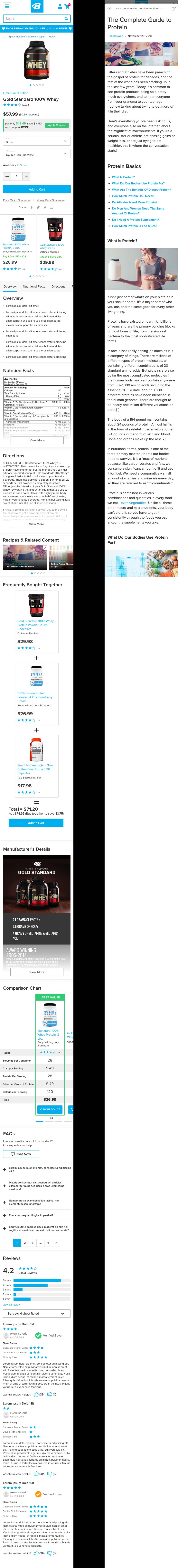
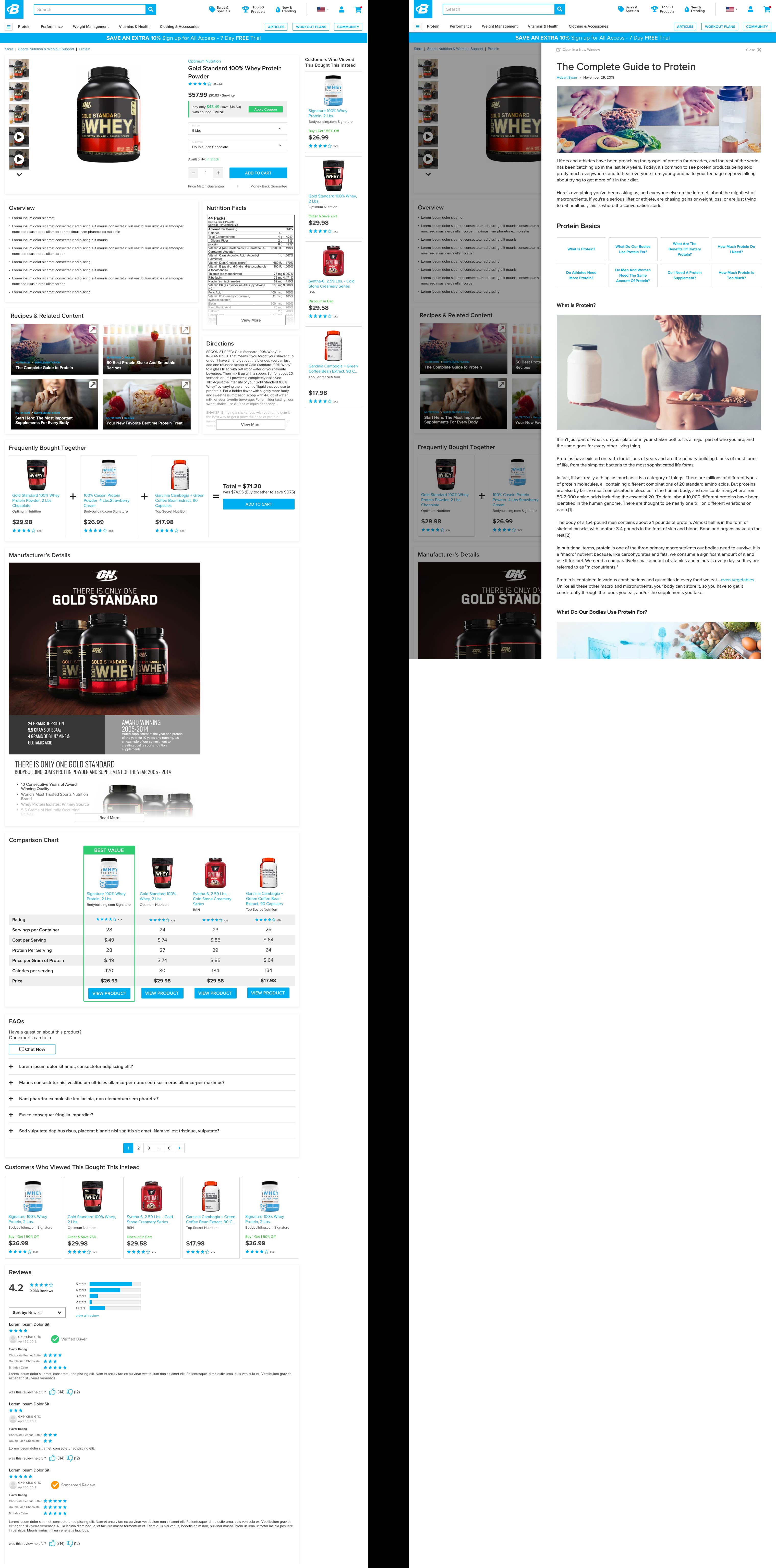
OVERVIEW: Bodybuilding.com’s Product Page was woefully out of date. It had numerous CTA buttons for each SKU on the product page. The goal of this project was to implement best practices for E-Commerce product page, while also, providing the ability to scale with new features such as, comparison tables, related content, coupon apply buttons, etc.
MY ROLE: UX Designer, Researcher, Information Architect, Usability Analyst
DELIVERABLES: Quantitative and Qualitative Research, Secondary Research, Information Architecture, Wireframes, Design, User Testing Results.
PROCESS:

TOOLS:
ANALYZE: We started this project by looking at traffic data for our top pages. We wanted to identify where users were coming from before landing on a product page. This would provide insight into information gathering needs. We also watched many user videos on FullStory to see how users interacted with current elements on the product page.
We identified that the application of a promotion was very confusing for our users. They often didn’t know how to take advantage of a coupon that was being promoted on the PDP.
We also, tested the current page with users in our lab and interviewed them about their experience. We found that most users don’t engage in reading the product description, but like that it was there to provide reassurance that the site and product was trustworthy.

IDEATE: We applied both the secondary research and qualitative research to start laying out a basic platform to bring the page up to date. We created about a dozen wireframes for testing, some with basic layout structure and some with innovative structure. After testing multiple layouts we found that the basic layout was preferred. Any deviation from the norm was confusion and distracting.
Once we had the basic layout we began designing each new feature within the page.

VALIDATE: With the addition of each new feature we tested, the full design with a single feature. We put our prototype in front of multiple testers to validate usability. Once that feature was approved, we added in the next new feature with a new set of tasks for each tester.
Once all features were added and iterated on we handed of to engineering to build.
DEPLOY: Due to the way we planned this project we took the final designs and parsed them down to 8 different releases. That way we wouldn’t make drastic changes all at once.
As of 9/5/19 version 2 is live. Version 3 is slated for Q4 release.
LEARN: Version 1 deployment was hugely successful. It increase PDP conversion by 14%. This project took about 8 months to bring to final designs and hand-off. As we completed work on one feature, a new feature was requested by the business. We had to work across multiple departments to prioritize releases. We also made a few mistakes along the way and allowed a “design by committee” to creep in. We had to ensure the stakeholders that the designs were fully tested and based on in-depth research.
