
1. Content Should Be Above the Fold
In the mid-90s the internet was new to most people and scrolling was a new concept people had a hard time wrapping their minds around. But now it’s second nature for most people. You no longer need to squish everything into the top of your page anymore. This is especially true since we don’t even know what above the fold is any more, due to the various dimensions of devices and screen resolutions.

Above the fold on my Retina display MacBook Pro is different than the Samsung monitor it is connected to. And above the fold is different on my iPhone versus my iPad. Above the fold is meaningless.
However, it’s still important to design your content in such a way that tells the user there is more below. If the header image cuts off perfectly along the bottom of the screen, the user may not think there is more content below. Also, it might mislead them to swipe to the right or left thinking it’s an image gallery.
While above the fold is still important and should be a consideration, it should never be a place to cram too much content. Content should be well spaced with signals to lead the user further along the page.
Here’s what others are saying about the fold and scrolling:
- Chartbeat, a data analytics company, found that out of 2 billion visits to various websites, 66% of the users attention is spent below the fold. Scrolling Behavior Across The Web
- ClickTale found that 76% of users scrolled within seconds of landing on the page, with 22% of those users scrolling all they way to the very bottom of the page regardless of the length of the page. Scroll Research Report
- Huge, a design agency out of NY, performed usability tests and fond that participants always scrolled, regardless of visual cues. Everybody Scrolls
- In July 2011, Apple removed the scroll bar from Mac OS X. This shows that we are so familiar with scrolling we no longer need a visual cue to do so.
2. White Space is Bad
White space refers to the empty space between various elements of a page layout or design. White space is often either neglected during design or thought of as bad – a valuable waste of screen real-estate. However, it plays a huge part in page readability and content prioritization.
Imagine you landed on a page that had no white space. What are your thoughts? Cluttered? Illegible? Information overload?
 White space allows the for better visual navigation through page and provides a feeling of sophistication and luxury. Cheaper brands want to cram more into the available space so that they can sell more. More confident brands (such as Apple) can afford more white space to better allow the product to speak for itself.
White space is not wasted space. It is an intrinsic and functional part of the design.
More about white space: White Space in Interactive Design
3. Always Follow the Leader
“Just because a design is published doesn’t mean it’s performing” – Stuart Maxwell, Information Architect at REI
This is a very common mistake, not necessarily by UX professionals, but by business leaders during discovery meetings for new design projects.
Have you ever heard this in a meeting?
“Check out [insert big name site]. See how they do [insert design element]? We should do ours like that.”
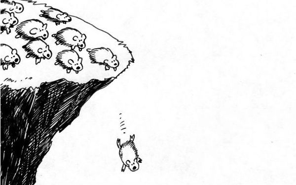 It’s fine to find inspiration and to, in some case, outright steal design ideas, but you should at least make sure they are working first. The very company you are finding your inspiration in might be going through the same redesign project you are because something’s not working. By using similar designs, layouts, etc. you may be setting yourself up for failure and be right back where you started, or worse actually harm you business.
Now even if you discover a particular design or layout is working for a particular site, doesn’t mean it will work for you too. Your users needs and values are not the same as everyone else. You have something special to offer them; a culture, lifestyle, service or product that is unique only to you. So don’t copy without knowing if it will work for you or at the very least user test your poached designs before publishing.
Other great reading on this topic: The “Just Copy Amazon” Fallacy
4. Testing is the Final Step
Waiting until the end to see if your theories are correct will only set you up for disappointment. Now whether you tested with your team, in-house or just know that certain design trends are “proven” does not fulfill the user testing requirement.
I’ve heard this many before, “Let’s just ship and we’ll iterate later.” This approach may help you get first to market, but will not increase engagement and may frustrate your users if you keep changing the design, layout or functionality. They may have to relearn behaviors to use your site; you can only do this so many times before they leave and never come back. Not to mention the fact that V2 is a lie.

Beta-testing only works if the beta-product is near full-featured. If it’s buggy or unusable, you may have blown your one shot at capturing a new, life-long customer.
Instead test early and often, and not with in-house “users”. They’re often to close too the product to give truly critical feedback or understand basic functionality intuitively because they are familiar with other design projects.
For me reading: Testing Your Product Early and Often
