
Bodybuilding.com
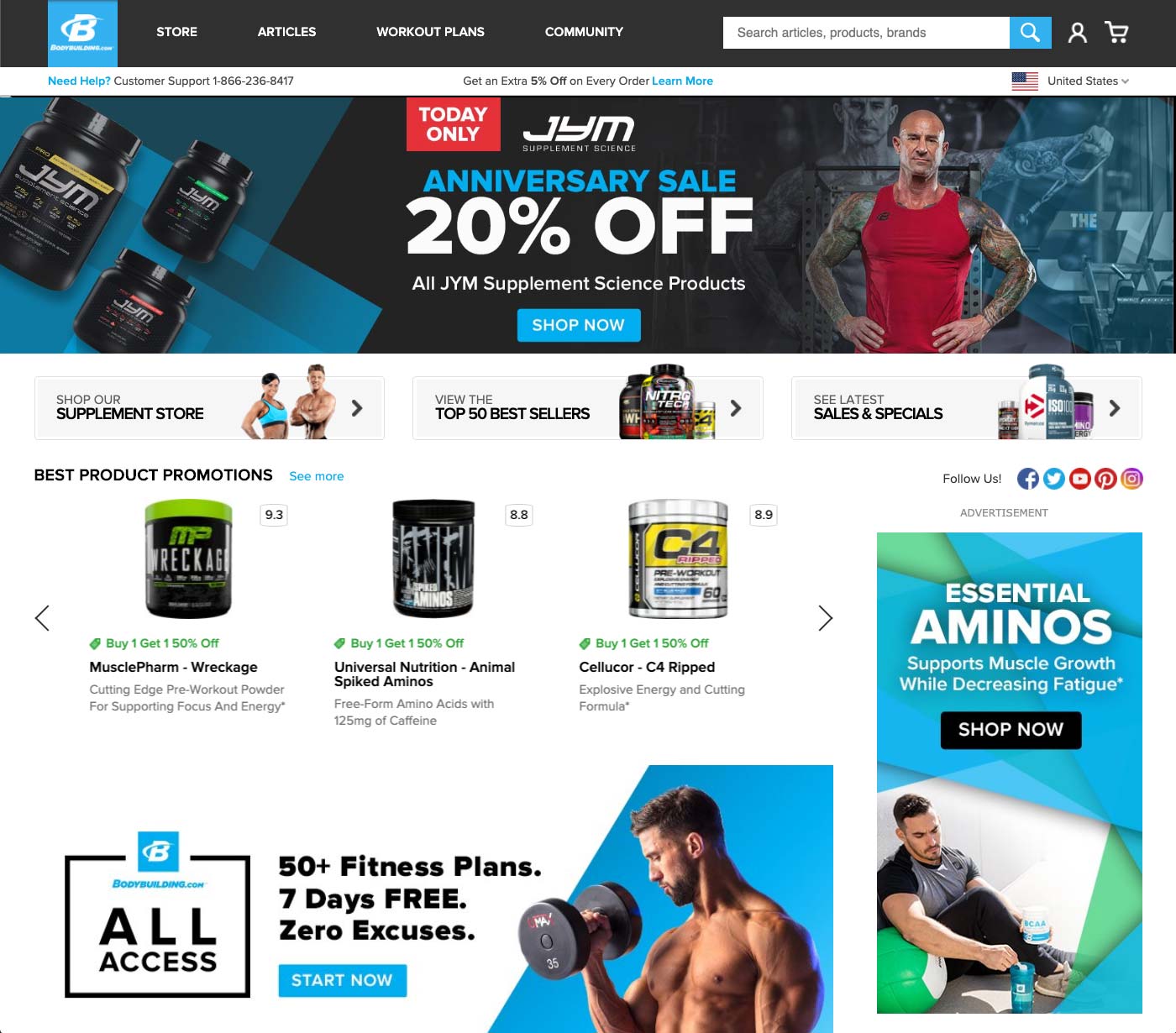
OVERVIEW: Bodybuilding.com aims to be a “total fitness solution”. It offers supplements, like protein, multivitamins, and energy drinks. While also offering over 12,000 free articles. It recently added a subscription model for premium workout programs. The homepage and navigation did not do a good job of showing all they offered. It also didn’t have very many opportunities for merchandizing to feature promotions or products.
MY ROLE: Lead UX Designer, UX Researcher, and Information Architect
DELIVERABLES: Competitive Research, Event and Next Page Data, Personas, Site Map, User Flows, Prototypes, User Testing,
PROCESS:

TOOLS:
ANALYZE: To validate the business problem and to understand users intent we first dove into Google Analytics. We pulled next page data from homepage for the last 90 days, but also for the previous years same time frame to compare. We also looked at click events to start painting a picture of user intent.
Most users on the homepage were going to 2 places: the Sales & Specials LP and a product category. Many users also used search from the homepage. However, those users that used search had a higher conversion rate than those that just were browsing. So we decided to focus on increasing conversion on browsers.

Once we created the browser persona, we found that there was a 60/40 traffic split for products versus content respectively.
Based on the data, we knew we had to provide more areas for current sales as well as provide some entry points to our various other offerings (content, subscription plans, recipes database).
We then reviewed Baymard reports, competitive analysis and conducted user interviews to identify best practices and build personas.
IDEATE: Once we had all our quantitative and qualitative research finalized, we started creating several wireframes with prototypes and began preference and task based testing.
We found that the main rotating banners we had in the wireframes did not get engagement beyond the first slide. Users were actually really quick to swipe/scroll down the page to see all that was there.

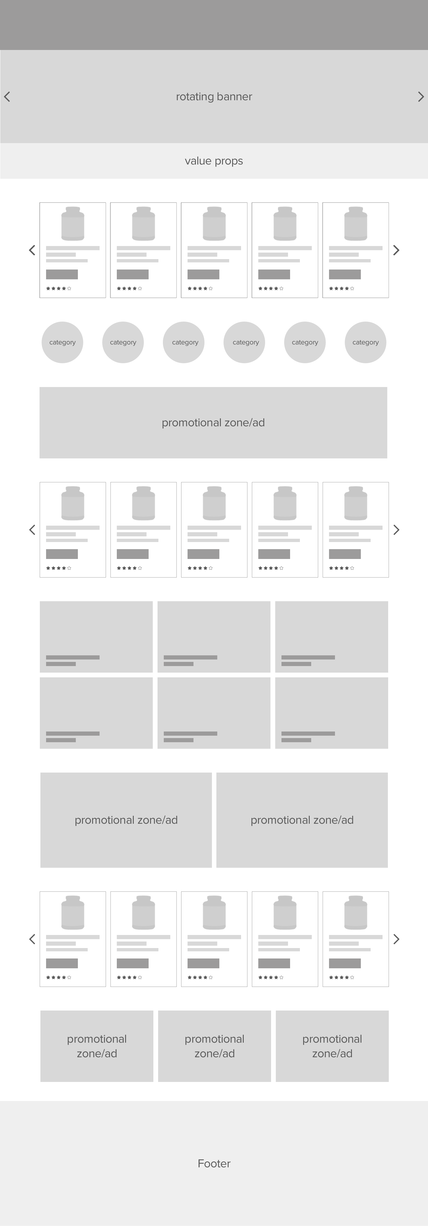
Some feedback from the wireframes was that users thought it looked a little cluttered and there wasn’t clear explanation what each section contained. This was important to validated with full designs and in context. Users that are looking for content swipe/scroll past product zones and users looking for promotions swipe/scroll past articles.

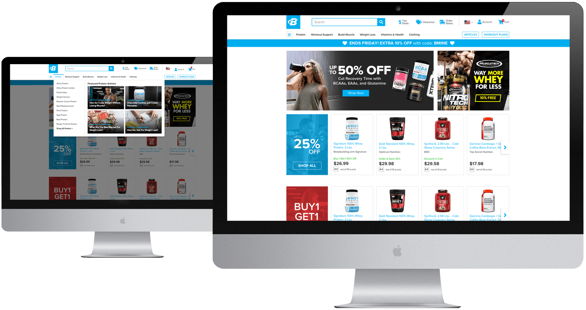
VALIDATE: We then built full designed prototypes and ran users through task based, contextual testing. We found that several users really liked the swipe-able product carousels, but didn’t like that we stacked articles. We also found that most users on mobile didn’t like how much space the categories took up. They were also unclear if they were product or article categories. After many iterations and tests later, we landed on a final design.
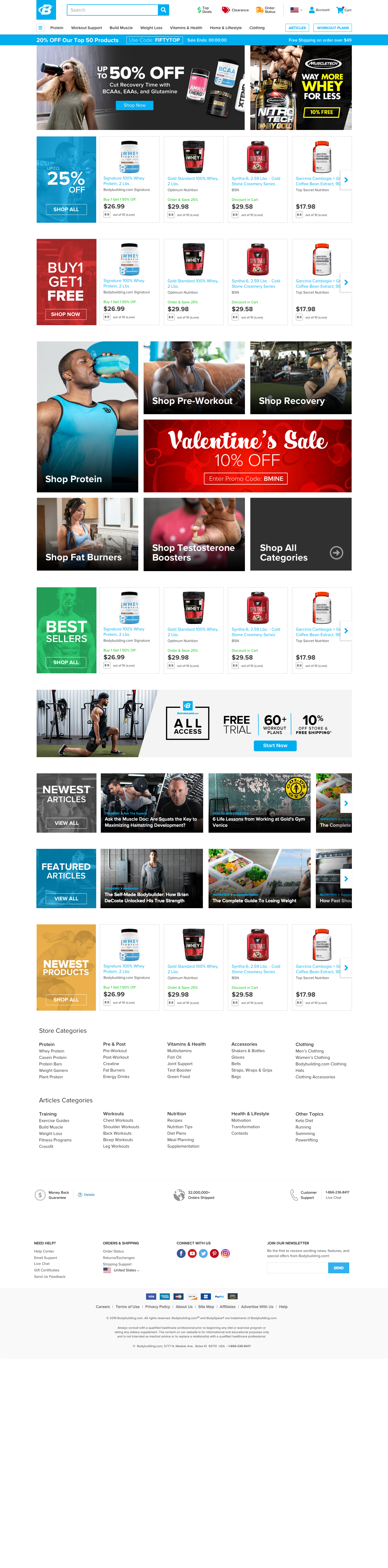
DEPLOY: As part of the deployment effort I worked with not only our engineers, but our merchandising team to ensure that the backend tool that managed the various zones could be customizable. Allowing full functionality and zone placement by the merchandising team. If they wanted 2 product carousels, instead of one, it was a simple drag and drop WYSIWYG tool.
LEARN: After deployment we saw a significant drop in article navigation, but a huge increase into our product catalog. This was somewhat expected and was okayed by the business. Because of the wysiwyg tool it allowed the merchandising team to A/B test various layouts to see what performed best on any particular day. Ultimately, this project was a great success!
 Eric Davis