Responsive vs. Adaptive Design: Reframing the Conversation

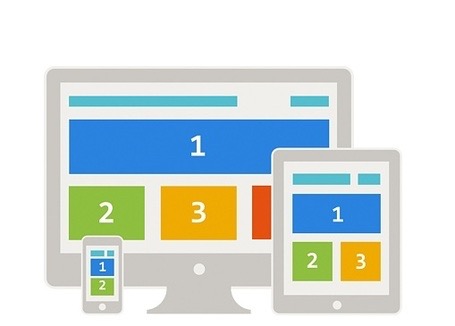
Responsive design has been around for years. It is a design methodology that allows the content on a web page to shift layouts as the browser window is resized, even down to mobile devices. This practice uses the same code by adding in media queries to call a different CSS or allows the individual content elements to flow as the content container is changed. Responsive design is great for desktop browsing experiences that allow the user to choose how they view your content. This also allows the content creators to manage all the same content across a multitude of devices.

However, some elements work on desktop, but don’t work on mobile. Responsive practitioners have become adept at scaling images, transitioning content or hiding specific content that doesn’t fit.

Responsive design helps give versatility to your content, allowing it to be consumed through a multitude of channels.

IMG_0648

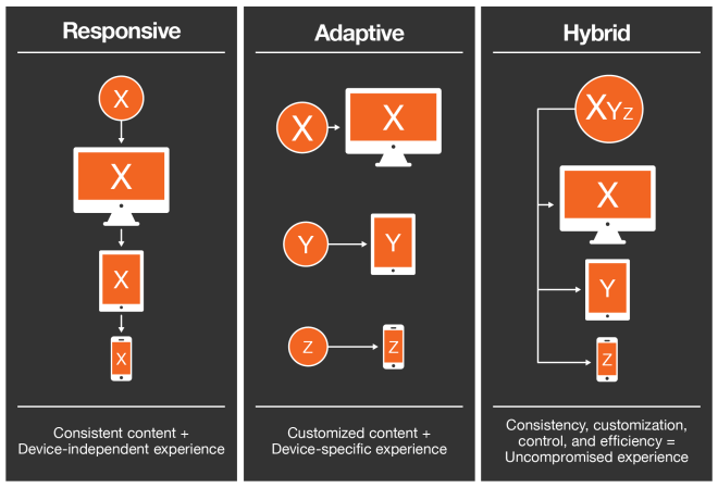
Where responsive design falls short, is it’s generally a one size fits all approach. The layout of the content is the same regardless of the context in which you’re consuming it. That means if the main content is image heavy or even text heavy it will load all the same content, regardless of the data connection or information need. If the user is on an iPhone they will see the same content as any another user on an iPhone.

Adaptive design is an approach that serves up similar content depending on what channel you are accessing the content on. Adaptive is not like responsive in that the layout on each device is often custom designed. This allows for greater control of the design, functionality and content.

It also means that multiple code bases need to be managed. A change to one, means you must change all in order for it to be consistent across all channels. If you have the resources and adequate processes to manage multiple code bases, I think the trade off is worth it.

Fortunately, it is not an “either/or” decision. We can use elements of both approaches to make elegant designs that work on a multitude of devices and serve a variety of information needs the customer may have.

image

Often when talking about adaptive design we stop short of what is actually possible with adaptive design. We talk about device type and that’s about it.

I believe adaptive design should not only look at the physical device it’s be displayed on, it should look at the context in which it’s being displayed.

We can leverage any number of APIs in the device to determine the context of the user. For example, we can use GPS in the users phone to determine at what rate of speed they are traveling. If they are traveling between 1-5 mph, they may be jogging. The information need is different at this speed then when standing still. The same can be said if they are traveling at 65 mph. The text in your content may no longer be relevant and it’s only the interactive elements that matter.

Adaptive design could also utilize the download speed to adjust the content. If the user in on wifi, all content can be loaded simultaneously, but if they are on slower bandwidth, then lazy loading might be a better solution. Users on slow networks can be served up lower quality, compressed images, while faster speeds will see full resolution, retina images.

The applications for adaptive design utilizing context is seemingly endless. They can be gathered through shared APIs on the device or through user toggles or settings.

Apple started doing this with their “do not disturb” setting. A user can now set the context for how and when an app should function.

image

When I think about applications that could utilize adaptive design, Apple Music and Podcast apps are top of mind. When I’m at my desk, the small buttons and large album art are annoying, but don’t pose any great usability issues. I’m still able to access all my music and podcasts with minimal effort. However, when driving home from work at 70 mph, the lay out of these apps pose new challenges. Skipping songs, replaying sections of a podcast or song or even changing the volume can be unusable or even down-right dangerous. If the app is able to intuit that I’m in my car and no longer stationary, it could serve up new content that fits my context and information need – big buttons and no album art.

When we not only consider the device, but also consider the context in which our content is being consumed, we will achieve the true definition of adaptive design.

Information Architecture and the Sofa

Imagine you just moved into a new apartment. You have an amazing sofa and a big screen TV. You’ve envisioned exactly how you’re going to set up your living room. It will be awesome. Your friends and family will come over and be in awe at the beautiful way you’ve designed your new space.

But what happens next is anything but. You lug your sofa up 3 flights of stairs only to find it’s 6 inches too long for the space you planned and covers the sliding glass door to your patio.

You set up your TV above the fireplace only to find the cable and electrical plugins are located 10 feet away. You must run a length of unsightly cords across the room.

And where is that bookshelf going to go? There isn’t any space created for it. I guess it’s going to have to go to your crazy cousin who doesn’t even own a vehicle and needs you to deliver it. We’ve all been there.

red-sofa

Your UX designer may have experienced the same thing in a digital space with your information architecture.

You laid out the infrastructure of the site beautifully, but what they’re left to design around really stretches their creativity to its outer limits.

Information Architecture is not web design, in the same way architecture is not interior design. But they are fundamentally tied together.

Architects (information or otherwise) need to consider the role the designer plays in the final product. We need to understand what new technology the UX designer might want to employ or new design trend they may follow.

We need to work hand in hand with our designer to understand the vision of the final product. There will be compromise. You may get that new navigation menu you wanted, but have to concede the placement of certain buttons. Your designer is important in the process. They are not just there to slap color on you architecture. Your collaboration is integral to the final user experience.

Great architecture with horrible design is just as bad as confusing architecture beautifully designed.

The same is with IA. We may not pick the “wallpaper” or “furniture”, but we need to build a system with that arrangement in mind.

Another thing to keep in mind is which spaces rely on the placement of other spaces. A sofa placed perpendicular to the TV will not create a great user experience when binge watching Doctor Who. Or a TV placed near a window may create a glare that makes daytime TV watching out of the question (sorry, no more Judge Judy).

Once you think you’ve considered every possibility of sofa/TV combination and architected accordingly, you may think you’re done. But have you considered A/B testing post-architecture? What if during user testing you find out the acoustics in the room actually make the sofa/TV arrangement better in a different location? Does your architecture allow for such deviation?

These are important question every IA should be asking themselves before finalizing the architecture. It’s not as easy to re-architect your site as it is to redesign it.

Designing with Your CMS Team in Mind

When designing a new site or app, you may begin to pen down all the great, revolutionary new features you are going to add in. As you begin user research you might notice them looking for information that is just not there on your current site or app. This is a great opportunity to build in that content into your designs.

However, adding these new elements into your site can have a significant impact for the CMS team who manages the data.

Take for example you’re working on an eCommerce site that sells t-shirts and you learn that users really want to know what the cotton/polyester blend is on said t-shirts. So you build in an awesome new widget that allows the user to filter out t-shirts within a given ratio. You also determine that t-shirt color is important and create a little swatch grid for users to select their desired color without navigating to the product page. These are both great ideas and should be implemented, but at what expense?

dont-forget-about-meToo frequently we design and develop with little thought towards who’s going to be managing this content going forward. And who is going to add these new data points to thousands of SKUs within the CMS or commerce platform?

The previous t-shirt example happened to me. I was managing the CMS team at the time of this new feature roll out. The designer built a beautiful new page design, got these new features to the developer and the developer started work immediately. I got called into the discussion 3 weeks before launch to approve the new feature roll out plan.

I asked the designer and developer, “How we were going about getting the swatch image for each SKU. Was it going to be automatically calculated based on the SKU image?” Nope.

“You’ll need enter in the hex code for each SKU”, they told me. “Oh, and we will launch in 3 weeks and we didn’t build in a fallback plan if a SKU doesn’t have a swatch.”

Great.

My team spent the next few weeks scrambling, reaching out to t-shirt vendors, seeing if they had the hex code handy. We also added plugins to our browsers to capture the hex code with a color picker. Fortunately, for everyone involved in this project we filled in every last hex code just days before the launch (we did have to spend some time post launch cleaning up some colors that were “off”). During this time of adding this new data point into our CMS, I had to pull valuable resources previously allocated to other projects, putting those projects behind schedule.

Now that we’ve got that out of the way we won’t have to worry about hex codes any more, right? Wrong. It’s now a new data point that we have to capture on each of the almost 100 new clothing SKU we add every week. Let’s say that this one new data point only takes us 1 extra minute to gather and input into our CMS. That is 100 minutes (2.75 hours) every week dedicated to this singular data point. By the way, we rolled out 15 new features and 6 new data points with that build. We later had to hire a new editor just to support the reduction in bandwidth on the team. All of which we had not planned on.

All this pain could have been significantly reduced, if not prevented altogether had the conversation started much earlier in the process. Often the CMS team can be the missing puzzle piece to help unify the final project and ensure a smooth launch and ongoing management.

So when you start your next design project, ask yourself the following questions:

  • Who’s going to manage this new feature?
  • Is the ROI for the new feature worth the management impact?
  • Should we loop the managing team into the design discussion?

After all, you want that new feature to be rolled out and managed correctly, right?