
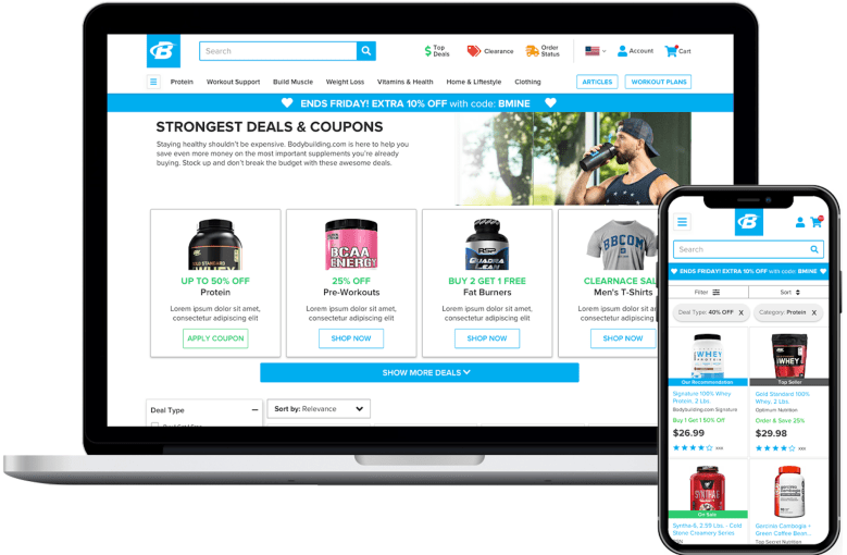
PROBLEM: The sales, coupons and campaign landing pages needed to be consolidated and follow similar layouts. Promotions need to be clear.
METHOD: We started this project by doing an extensive amount of competitive analysis. How did other sites in our industry layout their sales page. I found that they all had a similar look at feel to a typical category page (a list of products with a promotion type filter). However, some sites used a list of current promotions with links to the marketing landing page.
I decided to see if we could join these two types of pages to create a single page that is much faster and easier to find a good promotion.
I tested many different wireframes until I settled on a design that had a balance of current promotions and product list. We also had to work with the merchandising team to build out new SKU level attributes to allow users to filter by promotion type.
Previous coupon functionality forced the user to copy and paste a code into the cart. This often caused customer confusion as some couldn’t find where to enter the code. I worked with engineering and designed a way for the user to click on the code and apply it automatically to the cart. Once the code was applied in the cart, all product pricing changed on the sales page to reflect the new price.
RESULT: Project has not been deployed yet, but preliminary testing showed a very positive impact to conversion and user behavior.
