Understanding Content and Context

If you’ve spent anytime researching or working with Information Architecture (IA), you have certainly come across this venn diagram.

content-context-venn

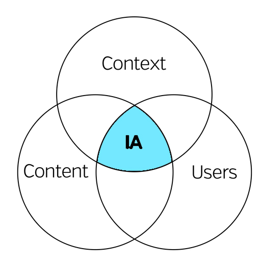
It shows that IA is at the convergence of content, context and the user. Rosenfeld and Morville referred to this as the “information ecology”.

Context is the business goals, funding, politics, culture, technology, resources and constraints

Content is documents, signage and data types or the structure of things

User is the audience, customer or agent

Although this diagram has been useful for many years to help show 3 important factors of good IA, it falls short in a few areas.

Because of this, we need to change how we look at this diagram.

First, I propose “understanding”, not Information Architecture, is at the convergence of user, content and context. Instead of being at the center, Information Architects are the unseen force arranging the meeting of these areas.

Although there are 3 areas influencing IA, all we really have control over is 1/3 of the venn diagram, the content. Context and user are predefined variables outside of our control. As we manipulate the content circle we increase, or decrease, the overlap of content and context and user, thus increasing, or decreasing, understanding. This means we need to thoroughly understand the relationship between user and context, prior to working on forming the content of our site and/or app.

Secondly, I believe the definition of context is partially, if not completely, wrong. Context is not the business goals or resources. Context is actually made up of 4 basic parts: the environment, culture, psychology and physiology of the user at the time of the interaction with “stuff and things”. Or as Andrew Hinton puts it in his book, Understanding Context, context is the “where” and “who” of the user.

The 4 basic parts of Context:

Environment: the surrounding climate, location and artifacts where an interaction is taking place (i.e. outside, inside, summer, fall, traffic, London). The interactions our users have with our systems is different when they are stuck in traffic in a big city versus when they are at home on the couch. A users information need is different in these 2 environments.

Culture: a users core belief systems established through nature and nurture (i.e. religious or political beliefs, sexual preference, gender identity, nationality). Language will have different semantics on site created for the African trophy hunters compared to GLAAD.org. Understanding your users core beliefs is key to not only serving them better, but to prevent alienating them with “harmless” syntax.

Psychology: a users mindset or emotions at the time of the interaction (i.e. happy, angry, distracted, frustrated). A users mindset when sitting down to binge watch their favorite TV shows on Netflix is different than when going to their banks website to find out why their paycheck wasn’t deposited and caused their mortgage payment to bounce. The users tolerance of poor navigation or confusing interactions is different because of their psychological state.

Physiology: the users actual body state (i.e. blind, deaf, left handed, tall, fat). The buttons and colors on an app designed for children may need to be designed differently than for professional sumo wrestlers. Button interactions may be more difficult for people with larger hands and will need be designed with this in mind. Blind users may need different queues instead of the normal audio queues after a button is pressed or an action took place.

Because of the above definitions, I believe that the user and context circles are even more “intertwingled” than the original venn diagram illustrates – even to the point of complete overlapping. Thus, we can simplify the venn diagram to merge user and context together into one circle.

content-context-venn2

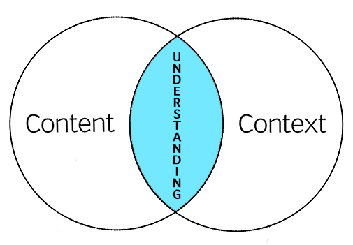
In the end what you are left with is that understanding is at the intersection of context and content. Our job as information architects is to organize the meeting of content and context. The closer we move them together, the greater the understanding for the user.

content-context-venn3

This new arrangement is important to understanding the role of IA in creating understanding. If we don’t know the beginning point of context, then how do we know if we should move the content circle right, left, up or down. To fully understand context, you must understand how environment, culture, psychology and physiology inform the user behavior. Mind you, this is no easy task, but critical.

Because context plays such a critical role in understanding, Information Architects must wear several hats to bring about this understanding. We must be anthropologists, psychologists and content specialists. We must study human behavior within these contexts in order to inform our work.

Instead of using a clichéd venn diagram to describe our work, I propose a new word: Contexnt or maybe Contenxt. Okay. I’m still working on it. Instead, below is a visual representation of this ideal.

content-context-understanding

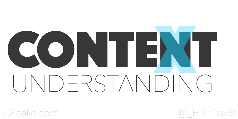
When content and context completely overlap we will bring about great understanding and great user experiences.

The Power of Storytelling for the User Journey

Storytelling is a great tool to help you understand the user journey.

Every user is the hero in his or her own story. Every visit to your site or app starts as a story with a goal and inciting incident, crisis, climax and an end. How we craft the user journey through the site will depend on the user goal. If we don’t understand the user or their goal how can we craft a user journey that helps them get to their a resolution of their goal.

To determine the goal of each user, we must first create personas to attach predefined goals to. A persona may have several goals and each needs to be factored into the crisis and climax moment. Personas is not the same as demographics. Personas takes much more thought and interacting with the user than just looking at analytics. Well defined personas are designed around goals, psychological profiles and user context.

In order to improve engagement and loyalty, we need to carefully create a crisis moment in the user journey. When a user overcomes the crisis, their loyalty to the story increases. They feel a sense of accomplishment. This crisis should be created in such a way that every user can overcome it, without creating a cliffhanger. This does not mean we create temporary painful user experiences only to manufacture a false sense of accomplishment. The crisis moment could be that they can’t find the right product and your site helps them navigate to find everything they needed and more. The crisis moment could be financial in origin. Just when the user thinks they can’t pay for the products they want, you present them with a coupon or bonus item or some content to move them beyond the crisis moment to a climax moment.storyarc-green-eggs

The climax is the resolution of the initial goal. They found the product or service they were looking for. Your site or app helped them accomplish this goal.

However, if a user arrives at the crisis moment and you do not help them to move to the climax moment, their story may result in a cliffhanger (ie. exit site or app). The crisis/climax transition needs to be crafted in such a way that the user knows you will help them through it and quickly. They must see the light at the end of the tunnel.

Once you feel you have the major elements of your story outlined, you can begin mapping that user story through storyboarding. As you map this out you may come across “subplots” and need to map those out as part of the journey as well. All goals, plots and sub-plots must find resolution to bring about a satisfactory conclusion for the user and build that loyalty to your product or service.

The user story could be episodic (a single visit) or a fully mapped user journey (life goals) with multiple crisis/climax moments. Each is important and should be mapped for each persona.

Defining the user journey through storytelling will not only help you to better understand your user and help them reach their goals, it will help you present these ideas to key stakeholders in your organization, either through storyboarding or user journey maps. As design and development get underway to support the user journey, each stakeholder can reference the story to determine if what they are designing and building matches the story arc and helps the user accomplish their goal.

Designing with Your CMS Team in Mind

When designing a new site or app, you may begin to pen down all the great, revolutionary new features you are going to add in. As you begin user research you might notice them looking for information that is just not there on your current site or app. This is a great opportunity to build in that content into your designs.

However, adding these new elements into your site can have a significant impact for the CMS team who manages the data.

Take for example you’re working on an eCommerce site that sells t-shirts and you learn that users really want to know what the cotton/polyester blend is on said t-shirts. So you build in an awesome new widget that allows the user to filter out t-shirts within a given ratio. You also determine that t-shirt color is important and create a little swatch grid for users to select their desired color without navigating to the product page. These are both great ideas and should be implemented, but at what expense?

dont-forget-about-meToo frequently we design and develop with little thought towards who’s going to be managing this content going forward. And who is going to add these new data points to thousands of SKUs within the CMS or commerce platform?

The previous t-shirt example happened to me. I was managing the CMS team at the time of this new feature roll out. The designer built a beautiful new page design, got these new features to the developer and the developer started work immediately. I got called into the discussion 3 weeks before launch to approve the new feature roll out plan.

I asked the designer and developer, “How we were going about getting the swatch image for each SKU. Was it going to be automatically calculated based on the SKU image?” Nope.

“You’ll need enter in the hex code for each SKU”, they told me. “Oh, and we will launch in 3 weeks and we didn’t build in a fallback plan if a SKU doesn’t have a swatch.”

Great.

My team spent the next few weeks scrambling, reaching out to t-shirt vendors, seeing if they had the hex code handy. We also added plugins to our browsers to capture the hex code with a color picker. Fortunately, for everyone involved in this project we filled in every last hex code just days before the launch (we did have to spend some time post launch cleaning up some colors that were “off”). During this time of adding this new data point into our CMS, I had to pull valuable resources previously allocated to other projects, putting those projects behind schedule.

Now that we’ve got that out of the way we won’t have to worry about hex codes any more, right? Wrong. It’s now a new data point that we have to capture on each of the almost 100 new clothing SKU we add every week. Let’s say that this one new data point only takes us 1 extra minute to gather and input into our CMS. That is 100 minutes (2.75 hours) every week dedicated to this singular data point. By the way, we rolled out 15 new features and 6 new data points with that build. We later had to hire a new editor just to support the reduction in bandwidth on the team. All of which we had not planned on.

All this pain could have been significantly reduced, if not prevented altogether had the conversation started much earlier in the process. Often the CMS team can be the missing puzzle piece to help unify the final project and ensure a smooth launch and ongoing management.

So when you start your next design project, ask yourself the following questions:

  • Who’s going to manage this new feature?
  • Is the ROI for the new feature worth the management impact?
  • Should we loop the managing team into the design discussion?

After all, you want that new feature to be rolled out and managed correctly, right?

Developing a Better UX Organization

Inspired by a Peter Merholz lecture at IA Summit 2015:

To deliver great user experiences, it’s not just about getting the best design out the door. It starts with getting the organization right.

There are different organizational models to deliver great UX. Each has strengths and weaknesses.

The most common organization model is a decentralized and embedded model. This allows each team (commerce, social, marketing, etc) to have a designer and developer and allows the designer to be included throughout the entire lifecycle. They are involved in decisions and part of the team. However, this causes a fractured user experience throughout the site and can be lonely for a designer to not be with other designers/developers.

Continue reading Developing a Better UX Organization