
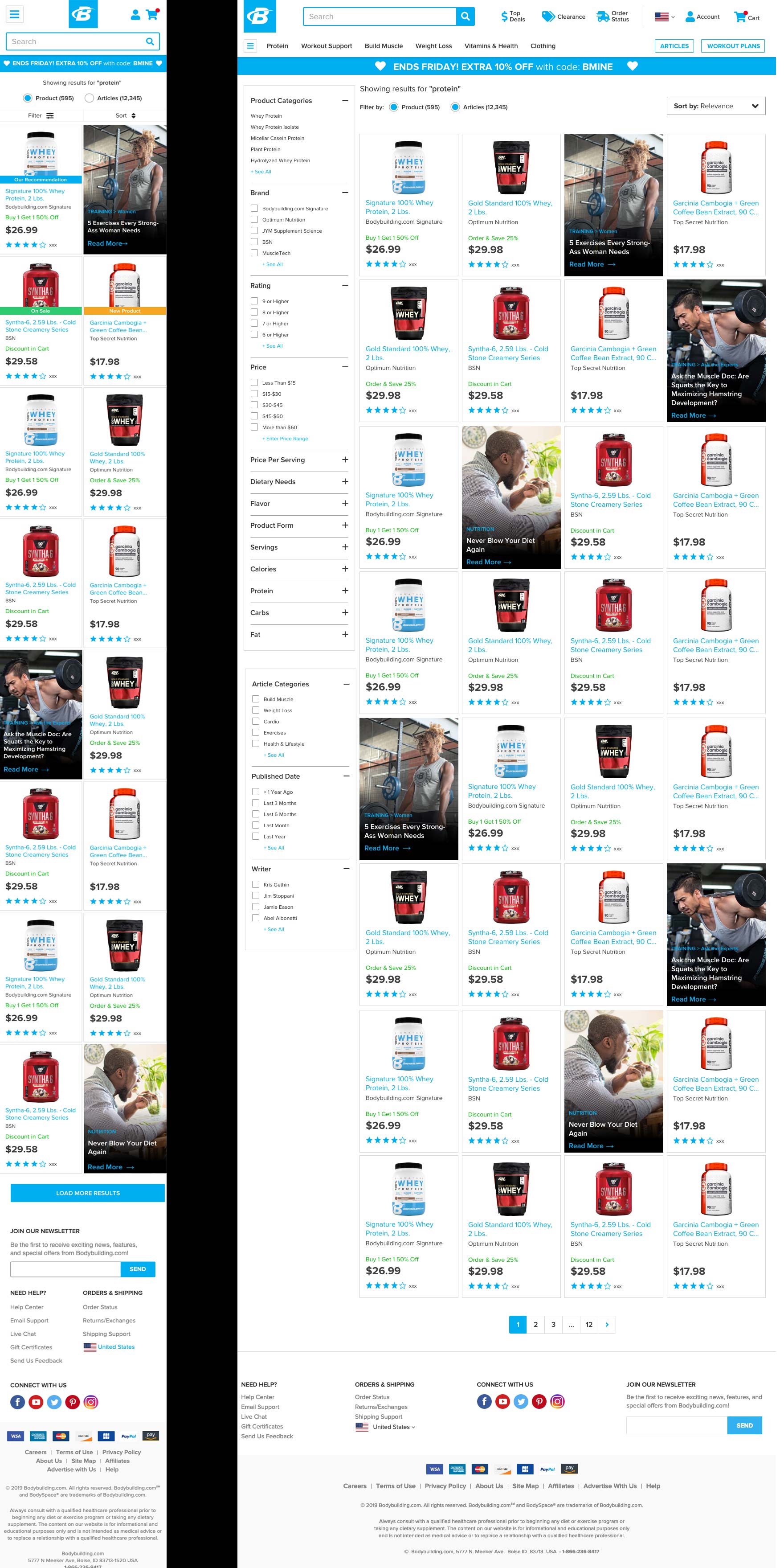
OVERVIEW: Bodybuilding.com’s search listing was in a list only format. The goal of this project was to make search and category pages into a grid format. The goal of this project was to bring us up to industry standards and to increase conversion for products that were currently on page 2 of listings.
MY ROLE: UX Designer, UX Researcher, and Information Architect
DELIVERABLES: Competitive Research, Search Data, Personas, Information Architecture, UI Design
PROCESS:

TOOLS:
ANALYZE: Since this was a straight forward request, there wasn’t much analytics to pull up. However, when looking at some of the data coming out of Google Analytics, we noticed that not users were not using the product filters, they were “pogo-sticking” from page to page to compare products.

I escalated these findings to the Project Manager and stakeholders to add filter re-design to the scope of work. By presenting compelling data and building a the user journey map, the team was able to identify with the user and increased the scope of work.
I also did quite a bit of competitive research to see what information E-Commerce sites displayed on product block and how many per row.

IDEATE: I started capturing the product data available and began ranking the information by user needs. We identified that name, brand, promotion, price, and rating were the primary. However, when using filters it was important to show the filtered meta data as well. Example: if a user filters by “contains 24 grams of protein or more” that meta data should be displayed within the product block.
Building out the product blocks I realized that we should unify the product block throughout the entire site. So I expanded the scope to look at how other areas of the site would utilize this new product block. The main areas were homepage and recommendation zones.

VALIDATE: Because the change to the product listing wasn’t a major change, we did not do any user testing prior to jumping into full design comps. However, we do perform several user interviews and surveys to identify what filters were most important on each category. Because we have over 200 categories, we decided to only research the top 10 and plan on rolling out the other categories on a case by case basis.
DEPLOY: As with most deployments, leading up we had to break out the various feature sets into version. The main product block has been deployed to search and is reusable on homepage and recommendation zones, but has not been deployed to category pages. Also, content integrated into search results is being deployed as an A/B test to ensure product conversion doesn’t decline.
LEARN: This project started out as a small request, but we ended up learning a lot about how our users are using search and category listings. It allowed us to escalate and address important usability issues. After deploying the new product block it increased conversion for products that had previously only been on page 2 of SERPs. It also improved our engineering deployments for other projects by creating a reusable product block.
